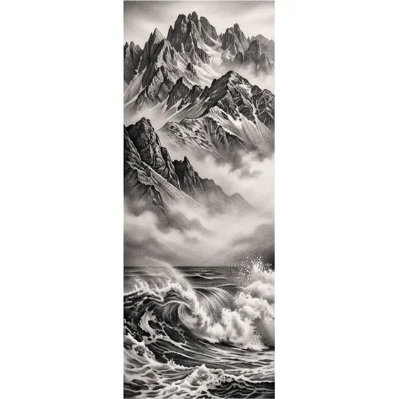
“A vertical composition of mountains fading into mist above breaking waves, inner forearm”
Generate this
Placement
The forearm is a long, slightly tapering panel, visible when you want it and easy to put under a sleeve. Inner and outer are not interchangeable. One faces you and stays out of the sun. The other faces everyone else and does not. Design for that cylinder, vertically, and stop before the wrist crease unless the piece is meant to end there.
“A vertical composition of mountains fading into mist above breaking waves, inner forearm”
Generate this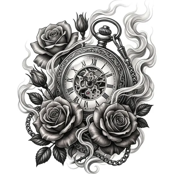
“A pocket watch surrounded by roses and drifting smoke, outer forearm”
Generate this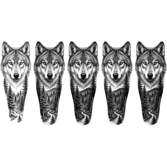
“A wolf's head with a pine forest behind, running down the forearm”
Generate this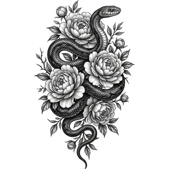
“A snake winding the length of the forearm through peonies”
Generate this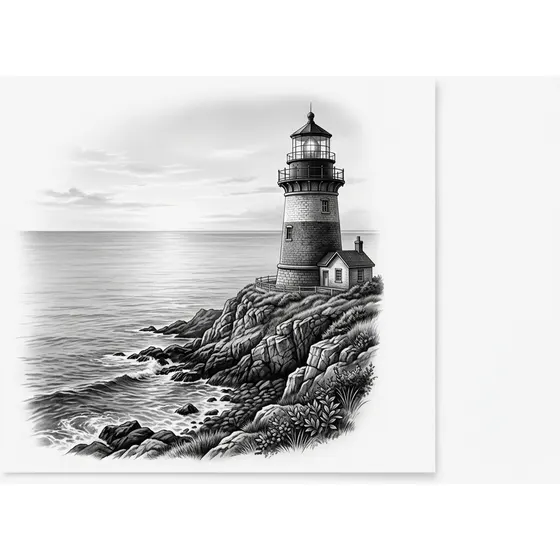
“A lighthouse on a headland above a calm sea, vertical forearm piece”
Generate this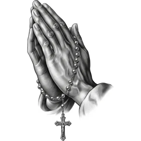
“A pair of hands clasped in prayer with rosary beads falling down the arm”
Generate this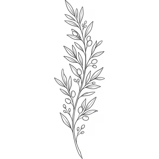
“A fine-line olive branch running vertically along the inner forearm”
Generate this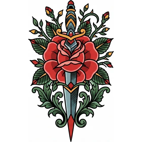
“A traditional dagger and rose, vertical, bold outlines, outer forearm”
Generate this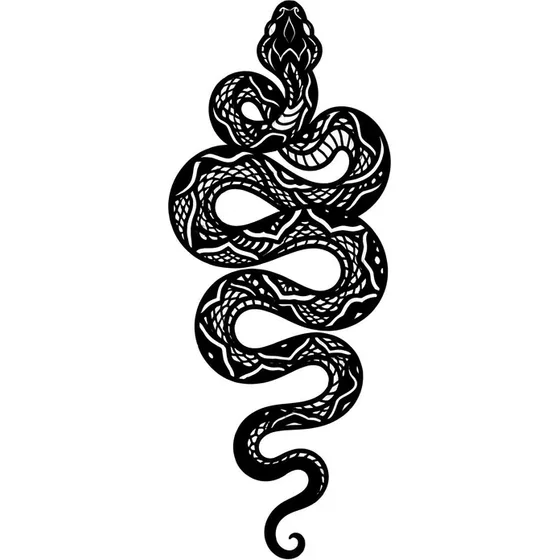
“A blackwork snake in solid silhouette down the outer forearm”
Generate this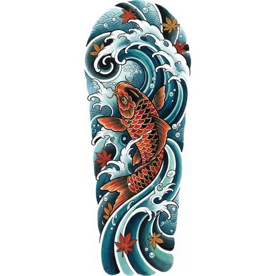
“A Japanese koi and a single wave, vertical forearm panel, no lettering”
Generate this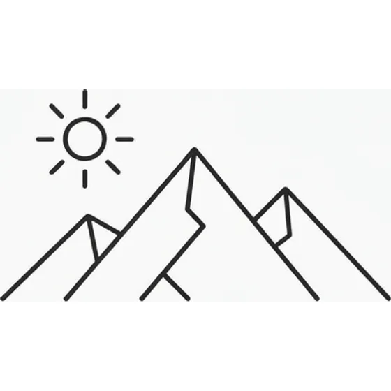
“A minimalist mountain line and a small sun, inner forearm, no shading”
Generate this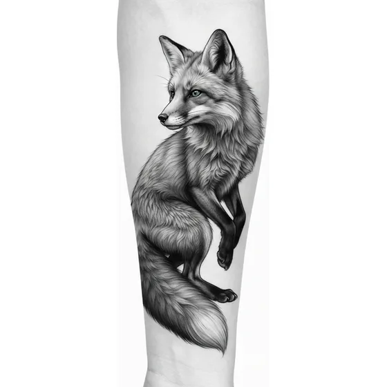
“A black and grey fox looking back, vertical, outer forearm, no text”
Generate this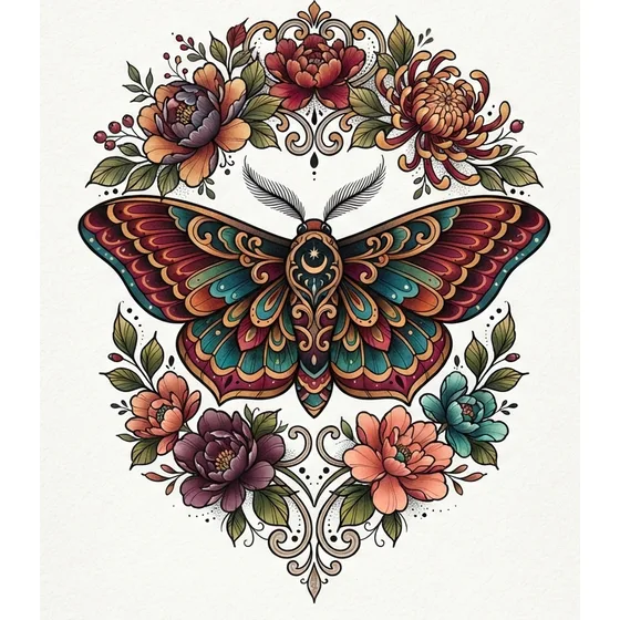
“A neo-traditional moth with flowers above and below, sized for a forearm”
Generate this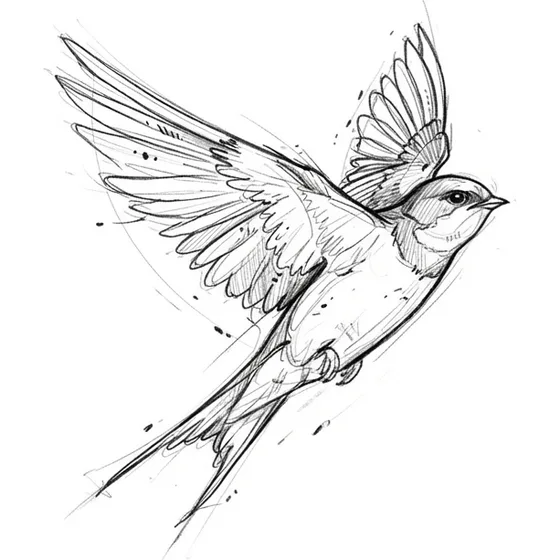
“A sketch-style bird in flight, loose lines, running down the inner forearm”
Generate this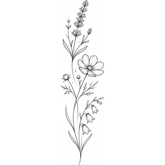
“A column of three fine-line wildflowers with space between the stems, inner forearm”
Generate this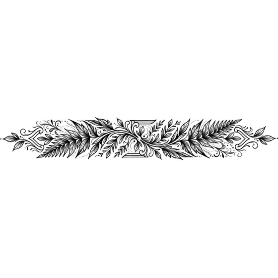
“A narrow blackwork band of leaves wrapping only partway around the forearm”
Generate thisThe inner forearm faces you. People choose it for a reminder, a name, a long stem, or a quiet scene, and because a shirt sleeve hides it. The skin is softer, and many people find the sitting sharper than the outer arm, especially near the wrist and the elbow ditch. Do not plan a huge inner-arm piece as a first tattoo and assume it will feel like the outer arm.
The outer forearm is the public panel. It reads when your arm is at your side, and it takes more sun. Animals, daggers, and traditional icons sit well there. Colour on that face needs sunscreen if you care about the reds. Black and grey is more forgiving with the sleeves rolled up.
The sides, toward the wrist bone, curve away from a straight-on view. Keep the focal point on the inner or outer face and let the edges stop.
From elbow to wrist the arm gets thinner. A design that is wide at the wrist and narrow at the elbow fights the limb. A stem, a snake, a stacked skyline, or a column of flowers follows the length you have. A horizontal band cuts the arm visually, so it should be a choice, not an accident of a landscape drawn sideways.
Leave the wrist crease and the elbow ditch as borders unless you mean to cross them. Those folds move, and detail parked on the crease wears faster. Ending a centimetre or two short of the wrist still looks finished. Colliding with a watch does not.
A forearm tattoo does not have to wrap. If it does, the artist is designing a cylinder. Say "front of the forearm only" or "wraps toward the inner arm" so the preview is not a flat poster.
One subject with a little environment fits: a flower and stem, an animal and a simple ground, a dagger, a short scene with a clear top and bottom. Three heroes and a background that never stops is a sleeve that happens to start on the forearm. If you might extend it, ask for open edges at the elbow rather than a hard frame you will tattoo through.
Script belongs here only if the line matches the length you have. The inner forearm is the classic place for a short sentence you can read yourself. The letters still need height. A quote that fits only in hairline type is too long. Lettering tattoos covers spacing.
The preview on a phone is larger than the tattoo. Mark top and bottom on your own arm with a washable pen before you commit to the crop.
Outer forearms see more daylight, so they soften faster than inner forearms. That is a reason to prefer stronger contrast there, and to sunscreen a colour piece, not a reason to avoid the spot. Inner-arm work stays covered in long sleeves and shows every soft gradient to you, every day. Muddy black and grey is harder to ignore on that side.
Healing is usually simpler than ribs, feet, or hands: you can see it and wash it. Watches, gym straps, and cuffs are the friction. Shift the design off the strap.
The arm turns, so a photo of a flat design will not match the worn result exactly. A realistic face needs the flattest part of the forearm. A traditional icon is more tolerant. Look at healed forearms in that style, not only the fresh photo.
Say inner or outer, top and bottom limits, and whether it stops before the wrist. Then one subject and one style. Generate a vertical version in the generator, throw away anything that looks like a square illustration, and bring the vertical one. If you are choosing between two subjects, generate both at the same height instead of combining them into a third, busier tattoo.
These are starting points. Change the subject, the placement or the size — the generator will follow whatever you write.
Start from scratch