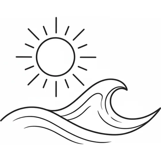
“A minimal wave and sun in single-weight line art”
Generate this
Style
A minimalist tattoo is what is left after you remove everything that is not the idea. A few lines, a lot of bare skin, no shading doing the work. It is not the same thing as fine line, which can be ornate as long as the lines stay thin. Minimalist is about how little is there. If the concept needs a paragraph to explain, it is not ready to be this small.
“A minimal wave and sun in single-weight line art”
Generate this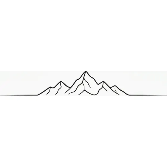
“A tiny mountain range with a thin horizon line”
Generate this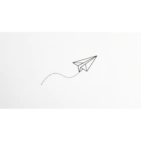
“A small paper aeroplane with a dotted flight path”
Generate this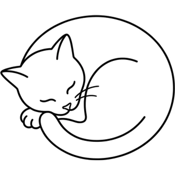
“A simple outline of a cat curled asleep”
Generate this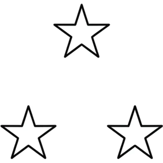
“Three small stars in a loose triangle”
Generate this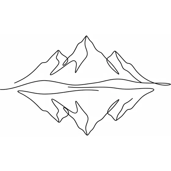
“A single continuous line forming a mountain and lake reflection”
Generate this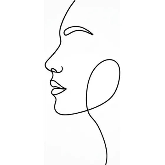
“One unbroken line drawing of a face in profile, no shading, minimalist”
Generate this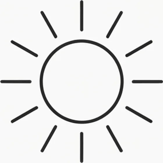
“A small outlined sun with short straight rays, single line weight”
Generate this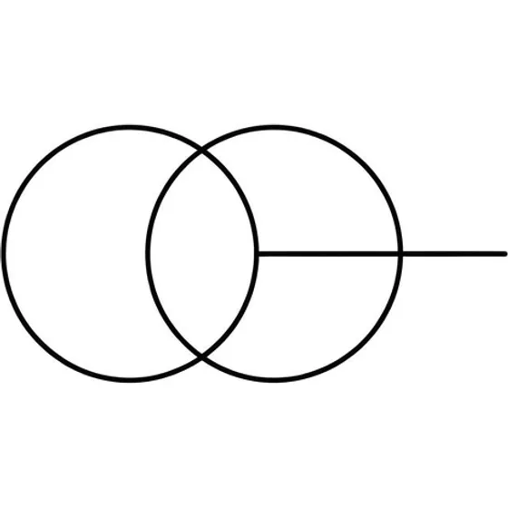
“Two overlapping circles and a short horizontal line, geometric and minimal”
Generate this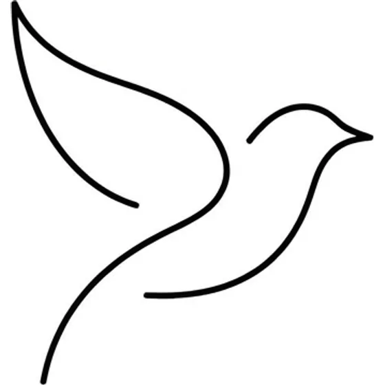
“A tiny bird reduced to a few curved strokes, no feathers”
Generate this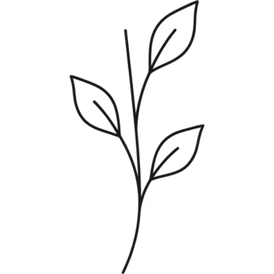
“A single stem with three leaves, even line weight, no fill”
Generate this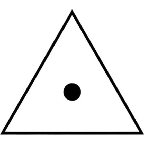
“A small equilateral triangle with a dot at its centre”
Generate this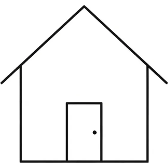
“An outline of a house reduced to a square, a roof, and a door”
Generate this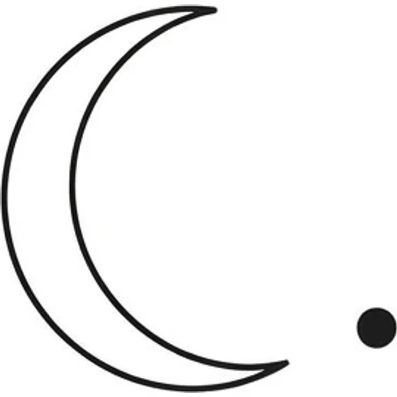
“A crescent and a single dot, wide spacing, wrist scale”
Generate thisStart with the sentence you mean, then cross out nouns. "A trip to the mountains" might become three peaks. The story can stay yours. The tattoo has to be the shortest drawing of it.
Continuous-line drawings, one symbol, a pair of shapes, a tiny animal as a silhouette: these survive. One short word can too, if the letters are large enough to stay letters. A sentence in hairline script is a lot of fragile marks pretending to be simple. Anything that has to be read belongs on the lettering page.
Fine line overlaps this look and is allowed to be busier: a stem of flowers, a moth, thin contours. If the reference is full of interior detail, you are in fine line, or in the wrong style. Say which before you add the word "minimal" to a crowded drawing.
These tattoos fail when the lines are too thin for the spot, or when two lines sit so close that healing joins them. Ink spreads a little as it settles. A gap that looks elegant on a screen can close on skin. Leave more space between parallel strokes than the preview suggests, and do not stack outlines.
The line does not have to be a hairline to count as minimal. On a wrist, ankle, or finger, a slightly heavier single stroke ages more honestly. The tattoo is still minimal if it is one mark. An artist may refuse a size they know will fall out.
Solid dots, short bars, and small geometric shapes are the bold end of the same idea. A faint line you can barely see in the studio will not become clearer later.
Inner forearm, outer ankle, the side of a wrist, a shoulder blade, the nape, and the ribs can hold a small mark. A horizon wants a little width. A stem wants length. A dot can sit almost anywhere you can stencil flat.
Behind the ear and on the fingers, keep it to one or two strokes. Those spots are popular because they are small, which is why they cannot carry a scene. Small tattoo ideas and wrist tattoos go further on scale. Hands need a thicker line than an inner arm; see hand tattoo ideas before a fine symbol goes there.
Bare skin around the mark is the style. Adding filler so it feels finished usually makes it age worse. If you may need a sleeve to hide it at work, choose the spot with that in mind — there is no large shape to disguise later.
A minimalist tattoo ages in one direction: lines get a little thicker and a little softer. That is acceptable when the design was a single clear stroke. It is a problem when the design was a tiny realistic object, a portrait, or a row of text. There is no shading to hide in, and no bold frame. The line is the whole tattoo.
Sun on an outer wrist or ankle speeds the softening. Friction from watches, cuffs, and shoes does the same. None of this means the tattoo vanishes on a schedule. It means you plan the healed version, which is slightly heavier than the stencil, and you do not add a second line just inside the first.
If you keep wanting to add a flower, a date, and a mountain to "balance" the mark, you do not want minimalist. Generate the larger idea in another style rather than insisting the small one carry it.
Put the subject in a short prompt and add "single line weight, no shading, lots of bare skin." If the result grows scenery, delete words and run it again. Compare two sizes in the generator before you fall in love with the smaller one. Take the clearer drawing to an artist and ask what line weight they would actually use on the placement you named.
These are starting points. Change the subject, the placement or the size — the generator will follow whatever you write.
Start from scratch