
“A tiny crescent moon with a single star”
Generate this
Collection
Small tattoos succeed when the idea is simple enough for the size—not when a large design is shrunk until the details collapse. At roughly two to three centimetres, simplify first, then size down.
“A tiny crescent moon with a single star”
Generate this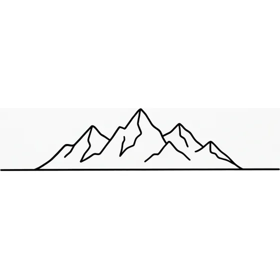
“A small mountain outline with a thin horizon line”
Generate this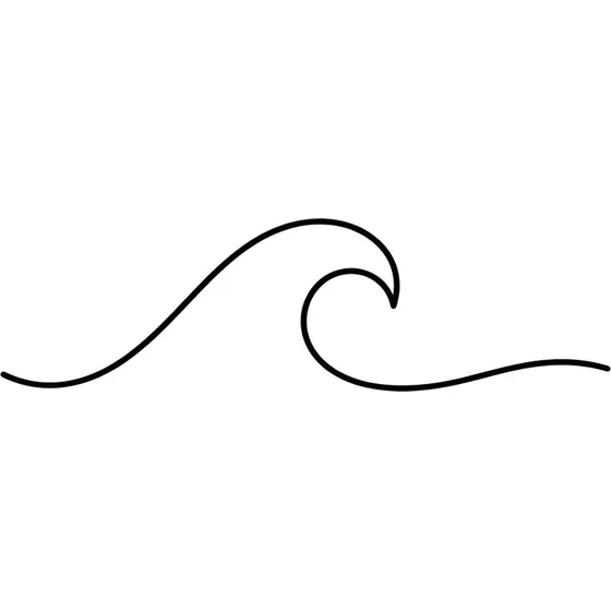
“A minimal wave in one continuous stroke”
Generate this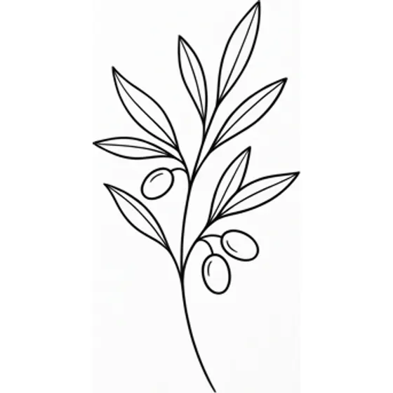
“A tiny sprig of olive branch”
Generate this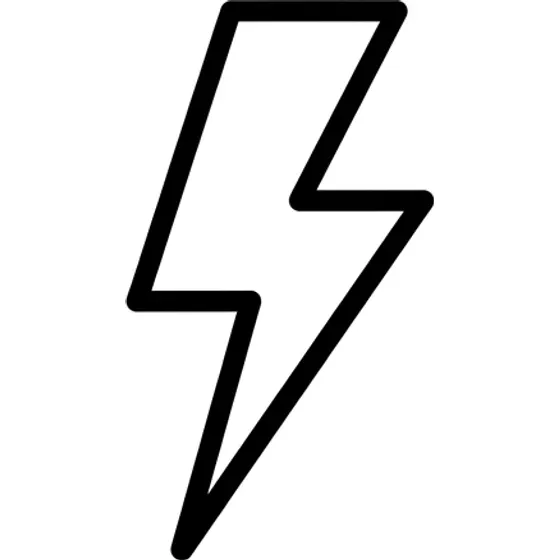
“A small lightning bolt in clean bold line”
Generate this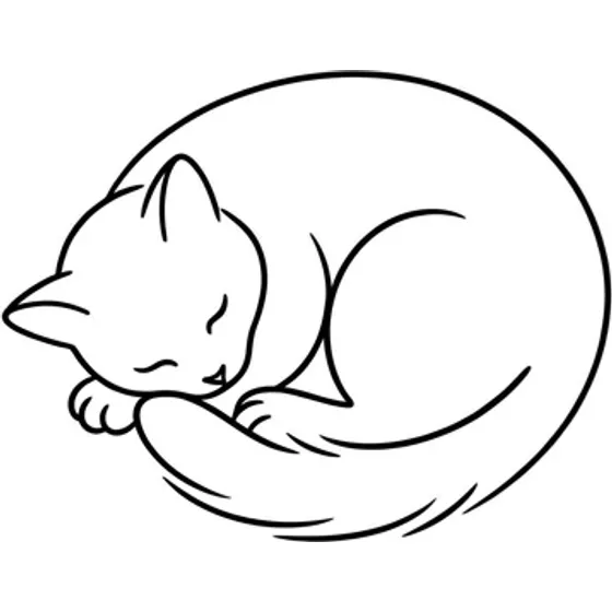
“A simple outline of a cat curled asleep”
Generate this“Small” is not a style—it is a size and clarity constraint: readable from a short distance without becoming a soft blot; usually a single motif (or two tightly related marks); limited interior detail, with outlines and negative space doing the work. It is often paired with fine line tattoos or minimalist tattoos, but also works in bold black for symbols that need thicker edges.
If you want a landscape, portrait, or full scene, scale the canvas up (forearm, shoulder, calf) instead of micro-packing the same prompt onto a wrist.
Good reasons to go small: first tattoo / low-commitment placement (first tattoo ideas); matching or complementary marks for couples (keep each motif dead simple); accent pieces in a growing collection (stars, initials, tiny flora); placements with limited flat skin—finger side, behind ear, outer ankle.
Signals you should go larger: the prompt needs facial features, dense text, or fine patterns inside a shape; you keep adding adjectives (“detailed,” “intricate,” “realistic”) to a centimetre-scale idea; side-by-side lines sit closer than a millimetre apart on the preview.
Inner wrist — moons, initials, short symbols. Avoid multi-line quotes.
Outer ankle / foot top — waves, bolts, small flora. Avoid tiny maps or skylines.
Behind ear / nape — single icon, mini script. Avoid double outlines plus fill.
Finger / side finger — bold simple marks; ultra-thin filigree is risky. See hand tattoo ideas.
Ribcage “secret” — small stems, coordinates. Avoid micro-portraits.
Collarbone edge — tiny stars, dots, charms. Avoid busy clusters.
Add the placement and a size cue in every prompt: “tiny,” “2 cm,” “wrist scale,” “single motif.”
Ink spreads slightly as it settles. On small tattoos that means: prefer fewer, clearer shapes over many hairlines; space parallel lines so they still read after softening; thicken intentionally for hands, fingers, and high-friction zones—still “small,” just not fragile; and test readability by viewing the preview zoomed out or at phone-lock-screen size.
These are design heuristics for concepting—not medical claims. Your artist sets final size on the stencil.
Go to the homepage generator. Pick a style that matches the mark: Fine Line or Minimalist for airy icons; Blackwork or Traditional for bold tiny symbols. Write a short prompt with subject + size + placement + “simple outline / single motif.” Generate a free preview; if detail looks muddy, delete descriptors instead of shrinking further.
Optional Pro body preview to see the mark on your actual wrist or ankle photo. Save favorites and compare; browse the gallery for scale inspiration. Credit packs and Pro are on pricing.
These are starting points. Change the subject, the placement or the size — the generator will follow whatever you write.
Start from scratch